Graphic Design Work
Hand and Foot Infographic
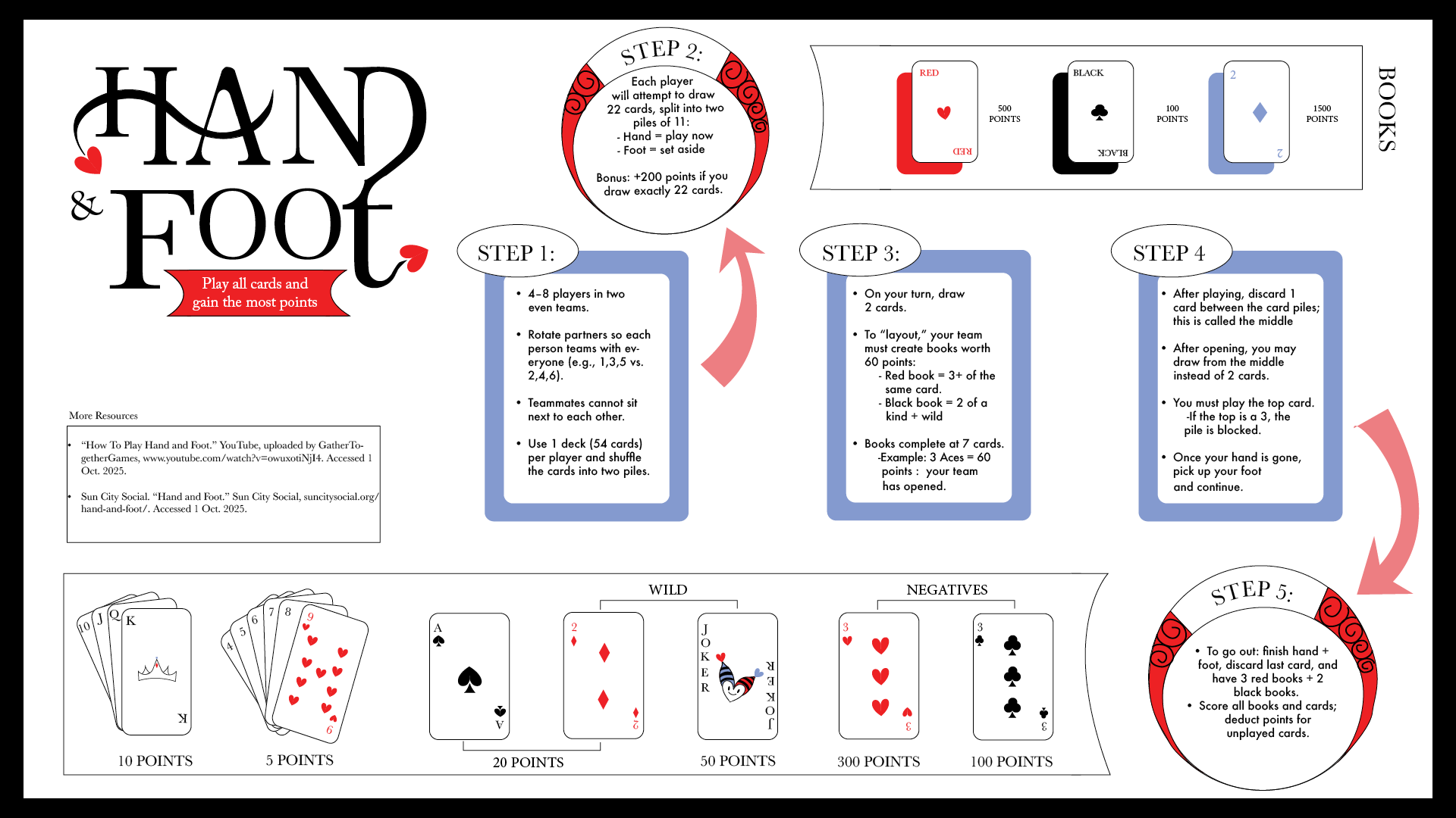
I created this infographic to explain one of my favorite card games, Hand and Foot, which I’ve never seen represented visually in my family or elsewhere. My goal was to design a resource that would help beginners quickly understand the rules and gameplay. The infographic emphasizes clarity and accessibility, using visual elements to make the instructions easy to follow and engaging for new players.
Marie Curie Type Poster
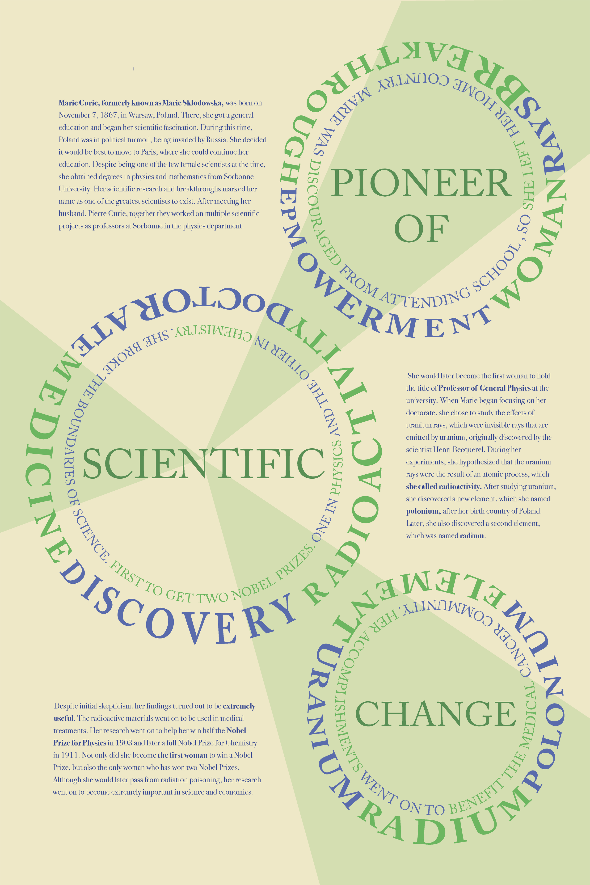
For this poster, I focused entirely on typography to convey the strength, intelligence, and independence of Marie Curie. The goal was to highlight her groundbreaking contributions to science and her impact on women in STEM, as well as her influence in the medical community, without using imagery. I chose a green and yellow color palette to reference the radioactive materials, radium and uranium, that she discovered. Through type hierarchy, spacing, and color, the design communicates her power and legacy in a visually striking, minimalistic way.
Hunger Games Trading Card Design
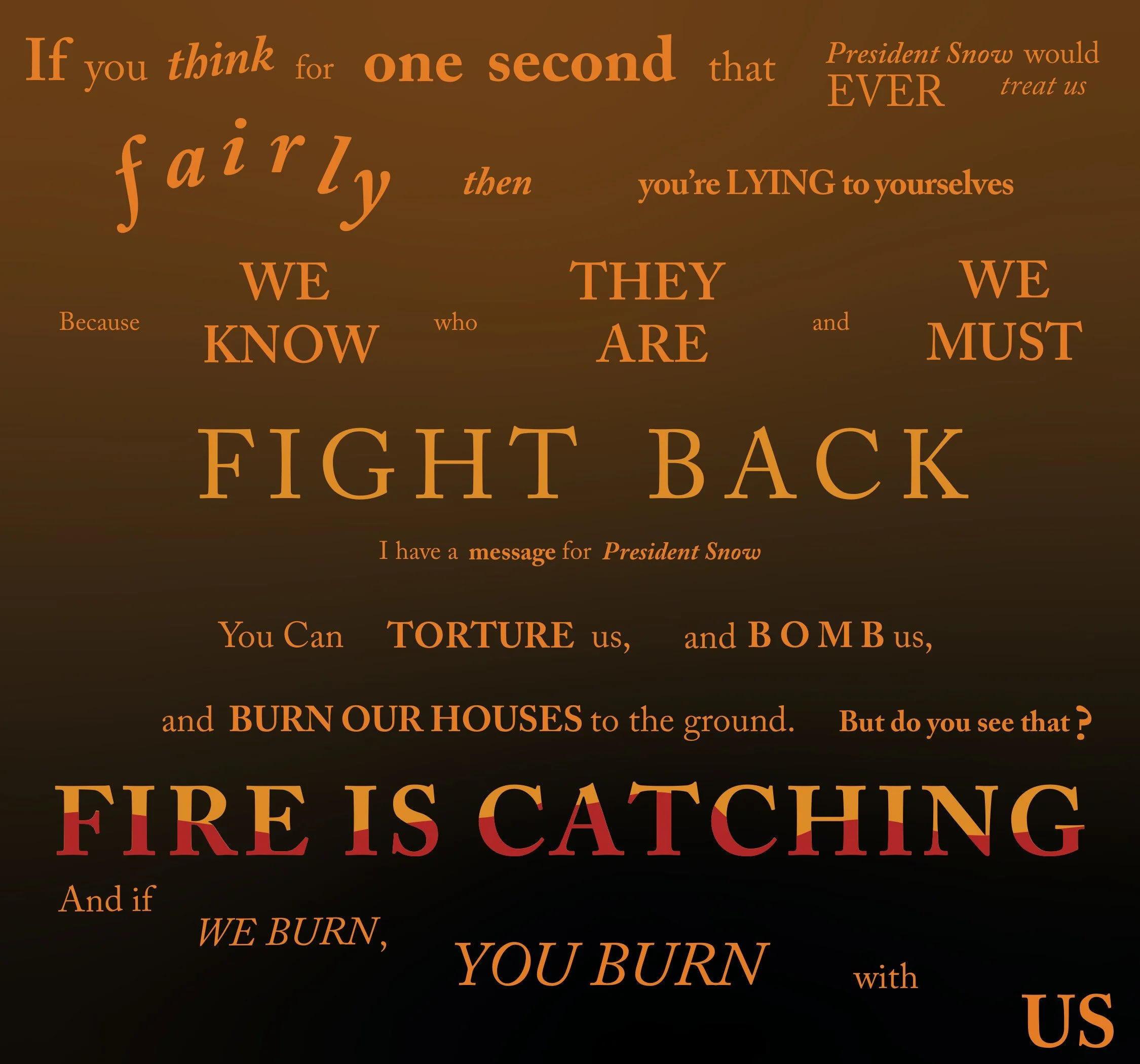
For this project, we were tasked with designing cards inspired by a movie monologue. I chose a monologue from the third Hunger Games movie that I found particularly impactful. This design represents the back of the cards, which are part of a set of six, with each card featuring a portion of the overall design. The goal was to create a cohesive visual experience across the set while reflecting the tone and emotion of the monologue.
Movie Poster Redesigns
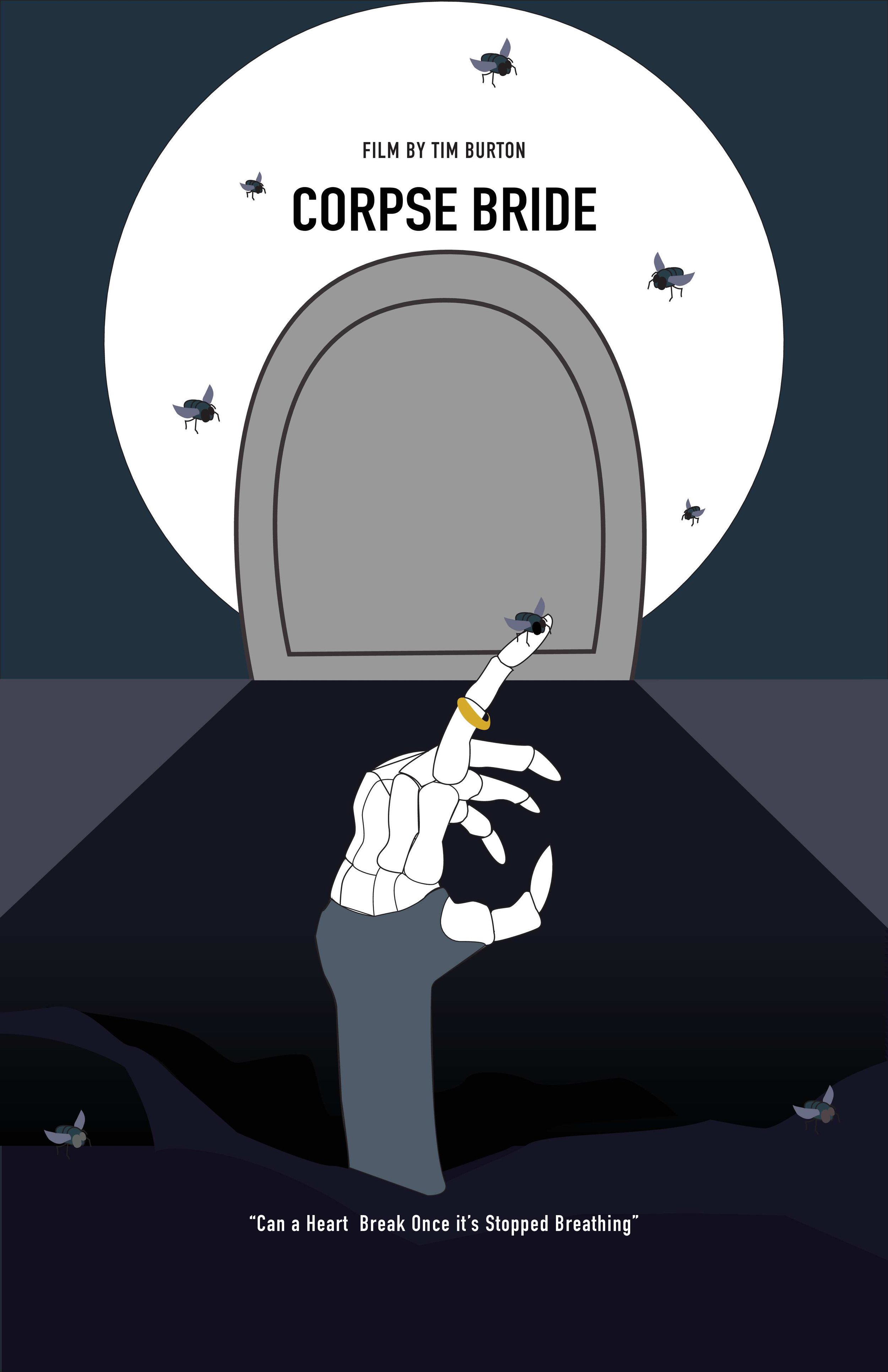
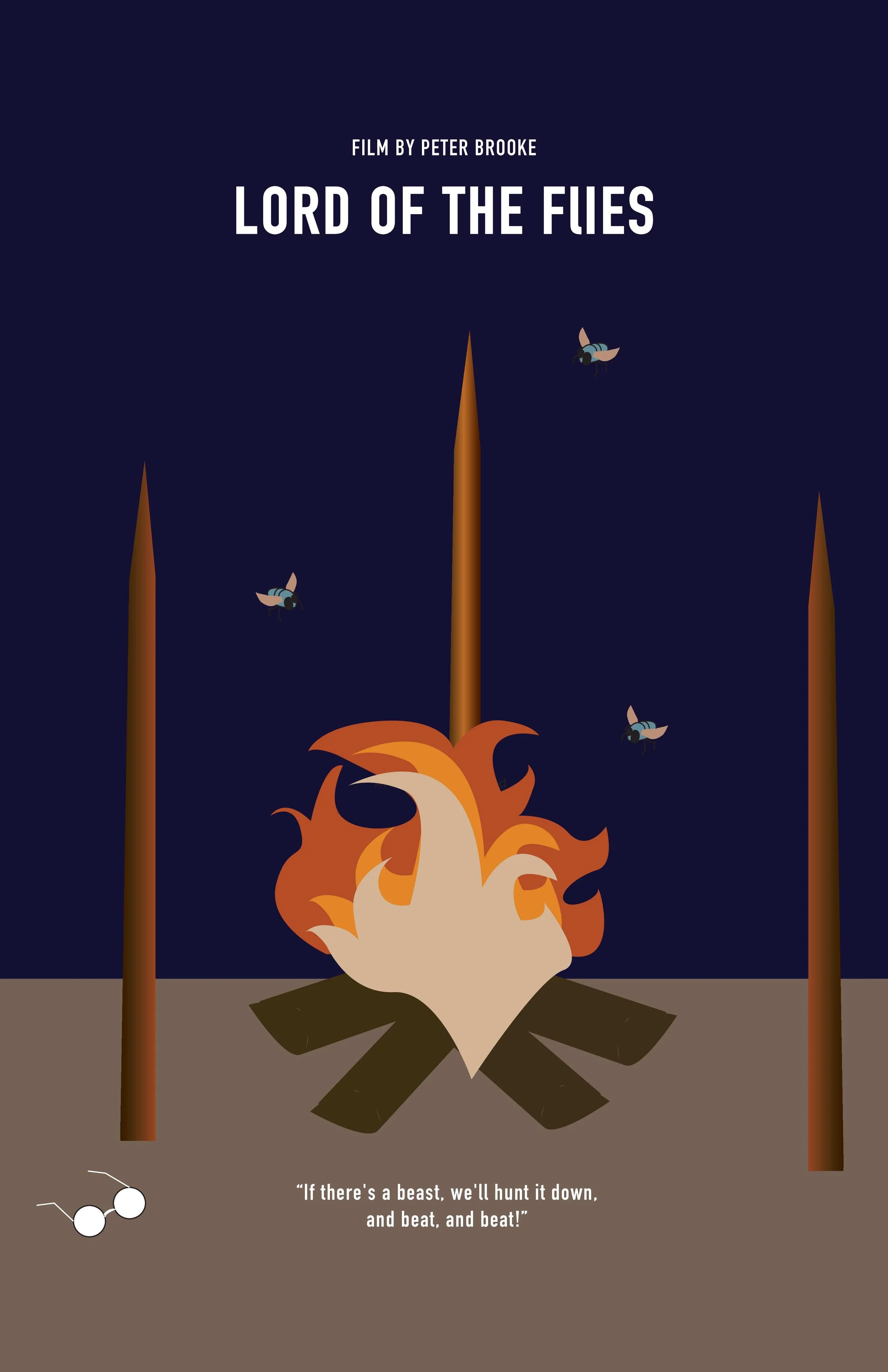
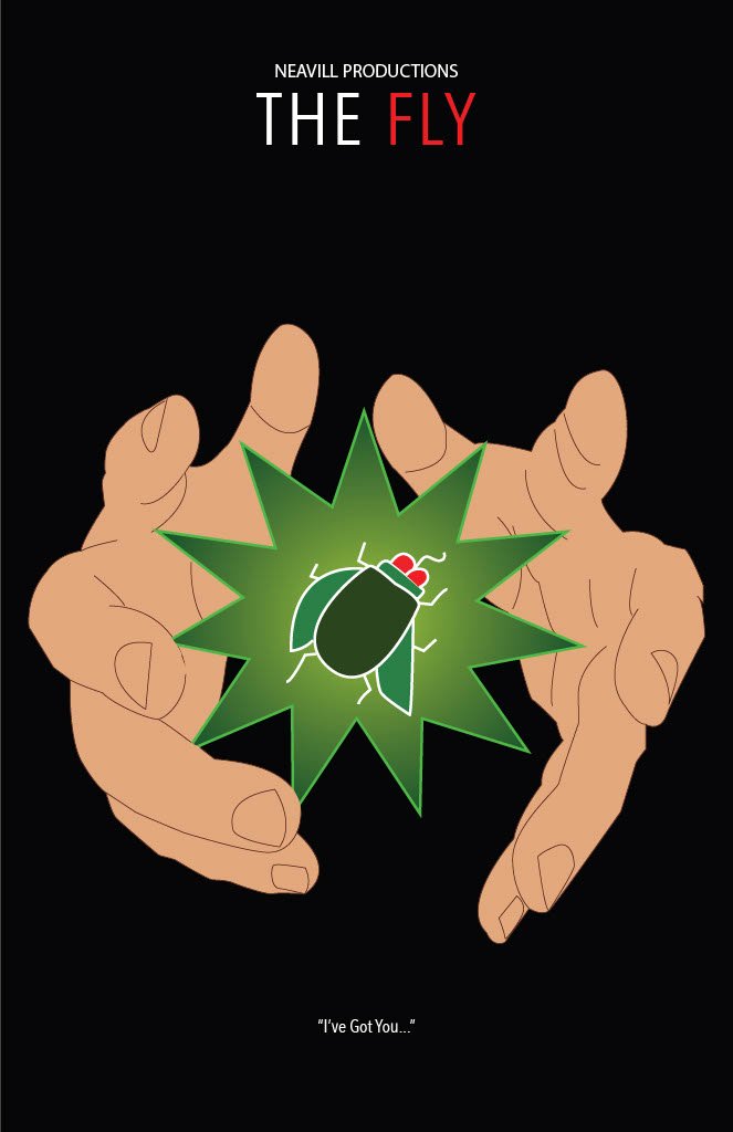
For this project, I redesigned three movie posters that all connect to the homonym “fly.” The set includes posters for The Fly, Corpse Bride, and Lord of the Flies. I created visual consistency across all three posters through similar imagery and design elements, while ensuring each one reflected the tone and story of its respective film. The project allowed me to explore creative reinterpretation and cohesive branding within a thematic series.
Typographic Portraits
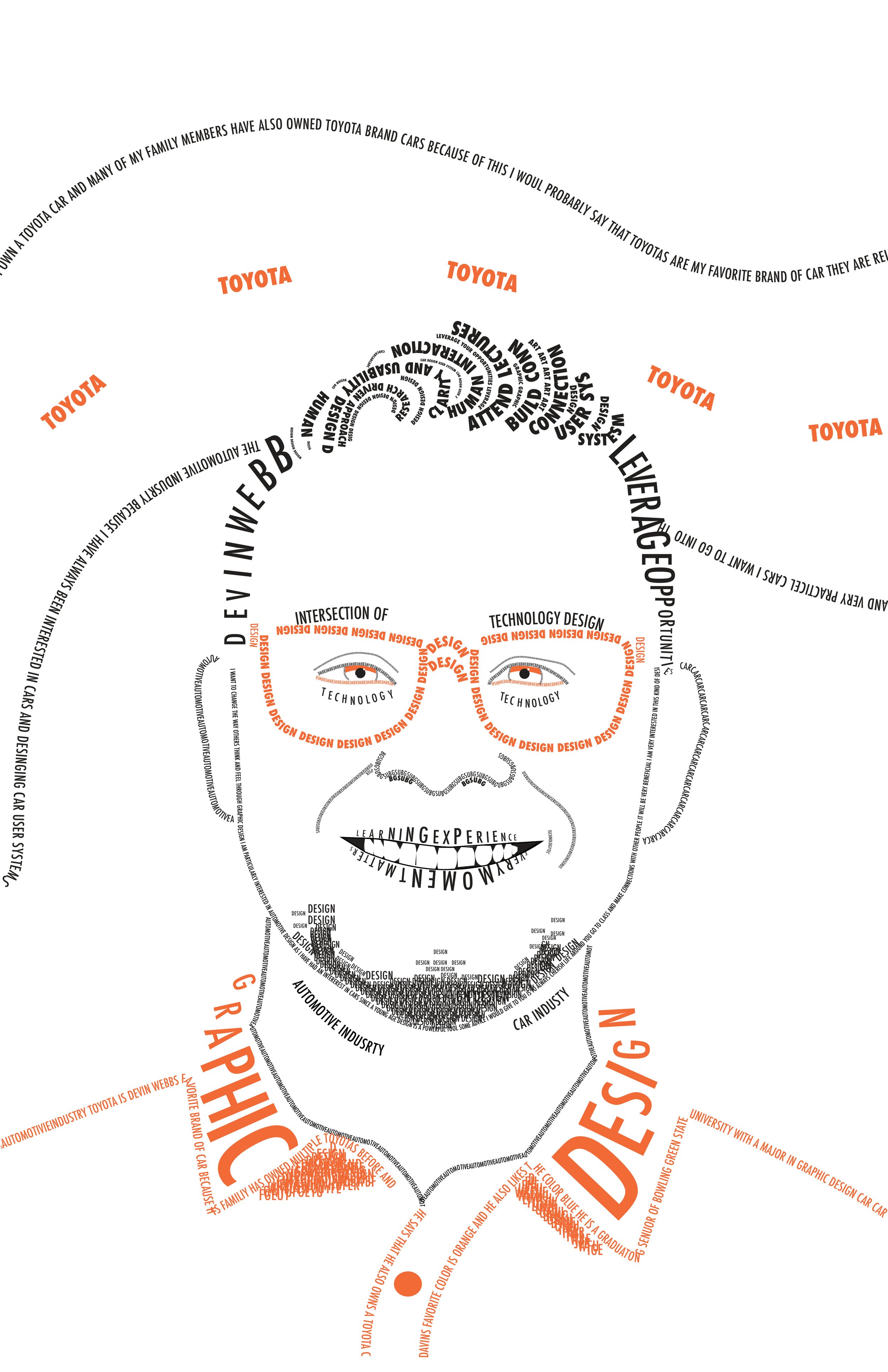
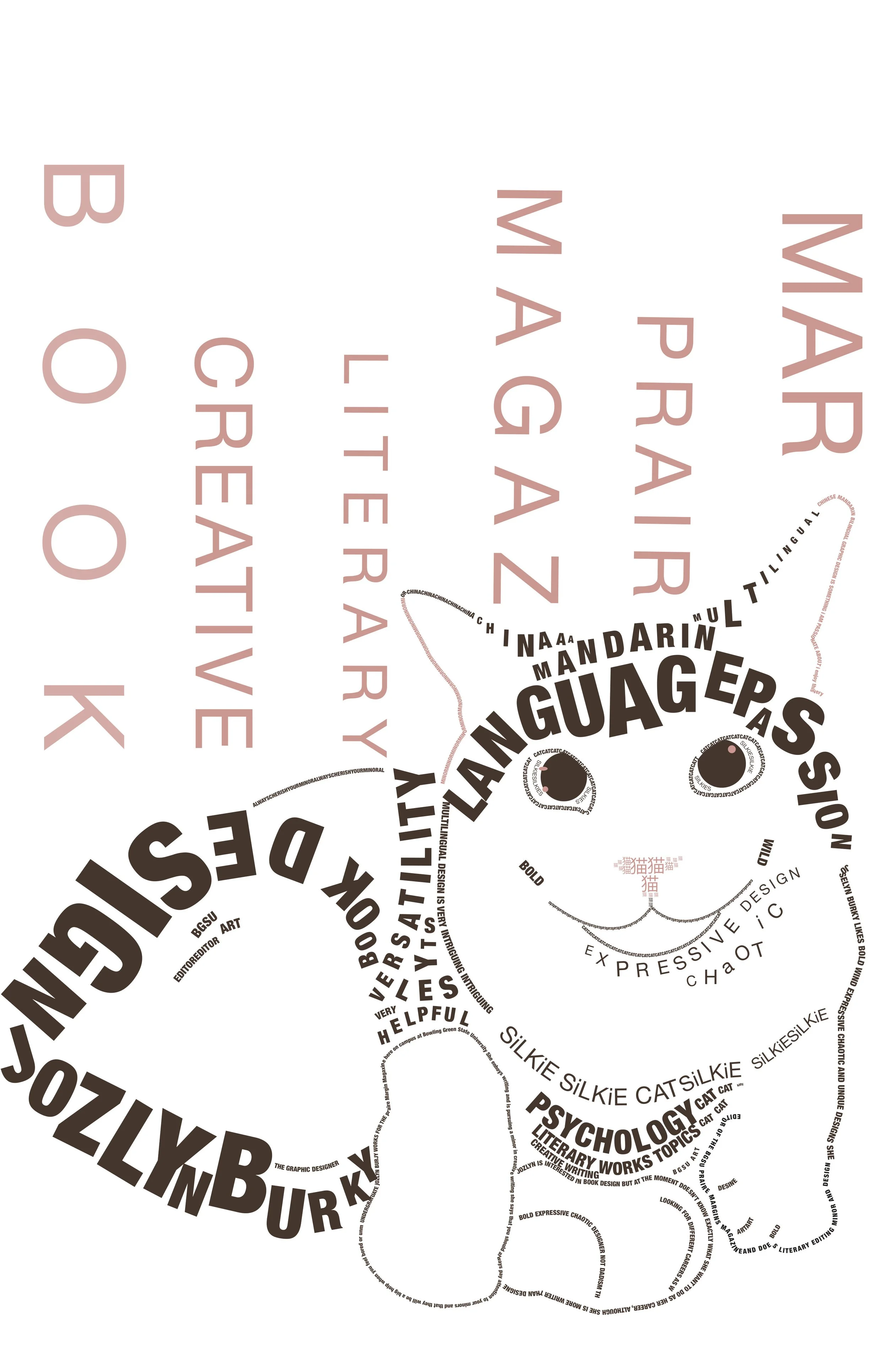
For this project, I created two typographic portraits based on interviews with two upperclassmen. I asked them about their design interests and future goals after graduation, then used their responses to form the portraits entirely with typography. The goal was to visually represent their personalities and aspirations through type, exploring how text can convey both meaning and form in a creative and personal way.
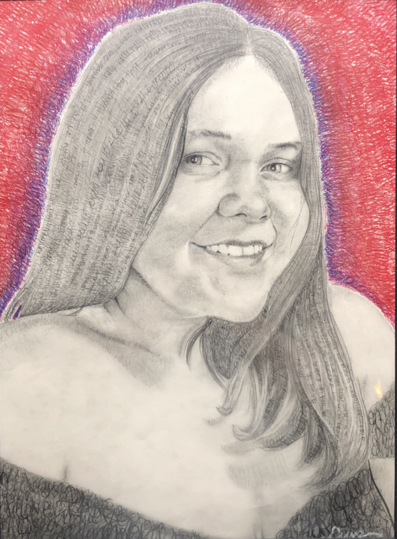
Traditional Art
Graphite and Colored Pencil Self Portrait. I used only type for the shadows. This portrait was completed during my senior year of high school for my design class.
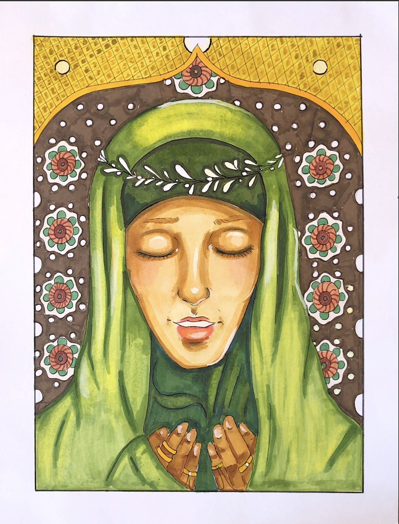
Marker and Paint Portrait. This is based on a mini thesis project where I explored the “perfect” woman from the three major religions. This work depicts the perfect woman in the Islamic religion.